Choosing the right color for your house’s exterior can feel like picking an outfit. It reflects who you are. You want it to stand out but also feel cozy, right? In 2025, the trends are shifting. We’re seeing a blend of bold and soothing shades. Let’s dive into some ideas that’ll make your home pop.
Earthy Greens

First up, we got Earthy Greens. These colors bring a sense of nature right to your doorstep. Think mossy hues or sage. It’s all about that calm vibe. Pair it with wooden accents and you’re golden.
Earthy greens not only look good but also blend beautifully with landscaping. You can have a natural flow between your home and the outdoors. Imagine lush trees and vibrant gardens surrounding a deep green house. It’s like a mini forest in your front yard!
Plus, these shades work well in both urban and rural settings. Whether you live in a city or a countryside cottage, earthy greens can make your place feel grounded. They’re versatile. You can go for a muted olive or a brighter fern. Each has its charm.
Warm Terracotta

Next, how about Warm Terracotta? This rich, clay-like color gives a Mediterranean feel. It works wonders in sunny areas. Plus, it’s cozy and inviting. Add some potted plants, and you got a little paradise.
Terracotta can make your home feel like a vacation spot. It’s reminiscent of sun-baked tiles and rustic villas. Picture a warm sunset reflecting off your terracotta walls. Beautiful, right? You can pair it with creamy whites or soft beiges to balance the warmth.
Don’t forget about texture! Using stucco or textured siding can enhance that Mediterranean vibe. You can even add some wrought iron accents for a classic touch. It’s all about creating that cohesive look.
Classic Navy Blue

Then there’s the classic Navy Blue. But wait, not your grandma’s navy. This one’s deeper and richer, almost peeking into black. It’s sophisticated and modern. You can match it with white trim for that crisp look.
Navy blue is timeless. It brings elegance to any home. Imagine a sleek navy house with bright white shutters. It’s striking! This color works well in coastal areas too. It reminds you of the sea and sky.
You can also play with different shades. A lighter navy can give a more relaxed feel, while a darker navy can feel more formal. It’s all about what vibe you want to create.
Soft Pastels

Now let’s talk about Soft Pastels. These are making a major comeback. Think pale pinks, baby blues, and mint greens. They give off a dreamy vibe. Great for coastal homes or cottages. Just imagine, a pastel blue house by the beach!
Pastels create a light and airy feel. They’re perfect for homes that want to exude charm and cheerfulness. You can mix and match pastel colors for a playful look. A soft pink door on a blue house? Yes, please!
These colors also work great in neighborhoods where you want to stand out without being too loud. They invite a sense of whimsy and fun. Plus, they can easily be dressed up with vibrant flowers and greenery.
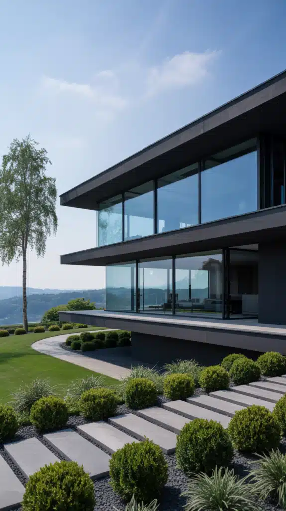
Charcoal Gray

How about a daring move with Charcoal Gray? It’s a bold alternative to traditional blacks. It’s sleek, chic, and pairs well with almost any accent color. You can add vibrant doors or bright window shutters to make it pop.
Charcoal gray brings a modern touch. It feels urban and sophisticated. You can create a stunning contrast with bright whites or even soft pastels. This color works well across various architectural styles, from contemporary to traditional.
Don’t be afraid to experiment! A charcoal gray house can look great with a wooden deck or stone pathway. It’s all about finding the right balance.
Bright Yellow

Let’s not forget about Bright Yellow. This is a color that screams happiness. It’s bold and fun! A sunny yellow house can brighten up any street. It’s perfect for those who want to make a statement.
Yellow pairs nicely with white trim. Think of a bright yellow house with crisp white shutters. It’s cheerful and inviting. You can even add some greenery to soften the look.
But be careful! Too much yellow can be overwhelming. It’s best to use it as a primary color and balance it with softer accents. A touch of gray or muted blues can help ground the brightness.
Deep Reds

Next on the list is Deep Reds. This color can evoke feelings of warmth and comfort. A rich burgundy or deep crimson can make your home feel cozy and inviting. It’s a great choice for traditional homes.
Red works beautifully with natural wood tones. Imagine a deep red house surrounded by lush greenery. It creates a striking contrast. You can pair it with creamy whites for a classic look.
Deep reds can also add a touch of sophistication. They’re powerful yet welcoming. A red door can symbolize good luck too! It’s a color that stands out but still feels homey.
Soft Neutrals

Moving on to Soft Neutrals. These colors are all about understated elegance. Think warm grays, beige, and taupe. They’re calming and versatile. Soft neutrals can work with any architectural style.
These colors allow for flexibility. You can accent with bold colors or keep it minimal. A soft gray house with a bright blue door? Yes, please! It’s a blend of classic and modern.
Soft neutrals also enhance your home’s natural beauty. They work harmoniously with landscaping. You can let your garden do the talking while your home complements it beautifully.
Ocean Blues

Let’s take a dive into Ocean Blues. These shades remind you of the sea and sky. They’re refreshing and calming. Think of light aquas or deeper teal shades.
Ocean blues are perfect for beach houses or homes in coastal areas. They create a serene atmosphere. Pair it with sandy beige accents for that relaxed vibe.
You can also experiment with different shades. A brighter aqua can feel playful, while a deeper teal can bring sophistication. Ocean blues are all about evoking that tranquil feeling.
Rustic Browns

Next, we got Rustic Browns. These earthy tones bring warmth and a sense of comfort. They’re perfect for homes surrounded by nature. A rich chocolate brown can create a cozy retreat feel.
Rustic browns work well with stone or wood accents. Imagine a brown house with wooden beams. It’s a harmonious blend with the environment. These colors can make your home feel like a part of the landscape.
You can also use lighter browns for a more airy feel. A soft beige can make a home feel inviting without being too heavy. It’s all about creating that balance.
Vibrant Oranges

How about a splash of Vibrant Oranges? This color is bold and energetic. It’s not for the faint-hearted! A bright orange house can make a statement and stand out in any neighborhood.
Orange pairs beautifully with earthy tones. Think of a vibrant orange house surrounded by green plants. It’s lively and fun! You can also contrast it with deep blues or cool grays to create a striking look.
Be mindful, though. Too much orange can be overwhelming. It’s best to use it as a primary color and balance it with softer accents.
Cool Lavender

Next up, we have Cool Lavender. This soft purple shade brings a sense of tranquility. It’s unique and refreshing. A lavender house can evoke feelings of calmness and relaxation.
Lavender pairs beautifully with white trim. You can create an enchanting look with it. It’s great for cottages or homes in serene settings. Imagine sipping tea on the porch of a lavender-colored house!
Cool lavender can also work well with greens. Think of lush gardens and vibrant flowers. It’s a color that invites nature in and creates a harmonious atmosphere.
Bold Black
Let’s not shy away from Bold Black. This is a color that exudes sophistication and drama. A black house can look stunning against any backdrop. It’s elegant and modern.
Black works well with a variety of materials. Think of wood, stone, or metal accents. You can create a stunning contrast with bright colors. A black house with a bright yellow door? Absolutely striking!
Don’t forget about lighting. Black can absorb sunlight, so consider how it will look at different times of the day. It’s all about creating that perfect balance of light and dark.
Bright Mint
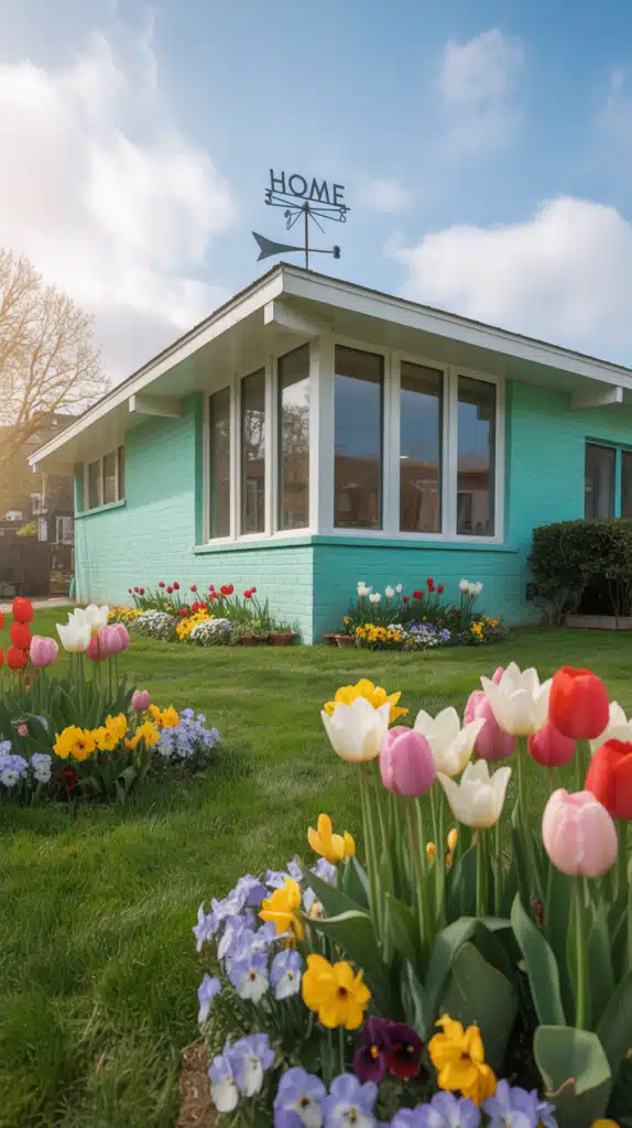
How about a fun twist with Bright Mint? This refreshing color is playful and unique. A mint-colored house can bring life to any street. It’s perfect for those who want to express their personality.
Mint pairs nicely with whites and pastels. Imagine a mint house with soft pink or yellow accents. It’s cheerful and inviting! You can also use it as a backdrop for vibrant flowers.
This color is great for modern and traditional homes alike. It’s versatile and can easily be dressed up or down. Just be ready for compliments!
Warm Coral

Finally, consider Warm Coral. This vibrant color brings warmth and cheer. A coral house can brighten any neighborhood. It’s a fantastic choice for those who want to make a bold statement.
Coral pairs wonderfully with neutrals. Think of a coral house with cream-colored trim. It’s fresh and inviting! You can also use it with greens for a garden feel.
Warm coral can evoke feelings of summer. It’s perfect for beach houses or homes in sunny climates. It’s all about creating that happy, welcoming atmosphere.
Conclusion
So there you have it! Eighteen stunning exterior house color ideas for 2025. Each color reflects a different mood and style. Whether you prefer earthy greens or vibrant oranges, there’s something for everyone.
Choosing the right color is all about expressing yourself. It’s your canvas. So, don’t be afraid to experiment! Mix and match, and find what resonates with you.
Remember, your home is your sanctuary. The colors you choose can enhance your space and bring joy. So go ahead, pick a shade that speaks to you, and let your home shine!

Mariana is an experienced blogger and interior design enthusiast at Mood Layered. With a keen eye for aesthetics and a love for cozy, functional spaces, she shares creative home decor ideas that inspire and delight.