Are you ready to give your home a fresh look for 2025? The exterior color of your house plays a crucial role in its overall curb appeal and can significantly impact how you feel about your space. Whether you’re aiming for a modern, chic vibe or a classic, timeless feel, the right color scheme can make all the difference.
In this article, we’ll explore 16 stunning exterior house color ideas that cater to every taste and style. From bold and vibrant hues to soft, serene shades, you’re sure to find inspiration that will transform your home into a true reflection of your personality. Let’s dive into these captivating color schemes and discover how to elevate your home’s exterior!
Not because it’s big. Not because it’s fancy. But because the color hits you in the chest like a really good song. Or the smell of toast at 6am.
Yeah, that. That’s what the right exterior color does. It doesn’t whisper. It sings. And 2025? She’s bringing new moods.
Some bold. Some soft. Some that feel like they time-traveled from a future where everything is calm and the air smells like rosemary.
Let’s talk colors. Real colors. For real houses. Not just catalog houses with impossible gardens and zero trash bins in sight.
1. Warm Clay That Feels Like Earth and Love Had a Baby

This isn’t brown. It’s not red either. It’s somewhere in the middle. Like sunbaked clay. The kinda color that makes you think of adobe homes, handmade pots, warmth on your skin.
Pair it with creamy trim. Maybe black windows if you’re feeling spicy.
Add plants. Big ones. Let them spill out everywhere.
Suddenly the house looks like it belongs on a quiet hill with goats and peace.
2. Sage Green That’s Basically a Hug for Your Eyeballs

Sage isn’t new. But in 2025, it’s getting… calmer. Less cool, more warm. Like it’s been sun-kissed.
It’s soft. Not loud. But it says “hey, I’m chill and also probably recycle.”
Looks perfect with dark bronze hardware. Or white trim if you want contrast.
Honestly, it’s hard to mess up.
3. Stormy Blue That’s Like a Sad Song in the Best Way

Okay, hear me out.
This deep, moody blue isn’t gloomy. It’s romantic. Thoughtful. A little mysterious.
It’s like if midnight and denim had a thing.
Put it on a modern cottage, and it feels timeless. Put it on a boxy modern home, and it suddenly has depth.
And when it rains? Oh man. It glows.
4. White but Not Just Any White—Toasted Marshmallow White

This isn’t sterile hospital white. This is soft, warm, slightly toasted white. Like if a vanilla latte melted into a cloud.
It works on anything. Craftsman? Cute. Colonial? Fancy. Minimalist cube house? Still looks good.
Add black accents and you’ve got contrast. Add natural wood and it becomes cozy magic.
White, but make it emotional.
5. Dusty Mauve for the Brave but Also Elegant People

You’re not gonna see this one on every block.
Which is why you should consider it.
It’s pink, kinda. But muted. Like it’s been sitting in the sun for decades. A little vintage. A little romantic.
Best on stucco or siding with lots of texture. Looks expensive even if it’s not.
6. Dark Olive That Screams Sophistication but in a Forest Way

Dark green is going full-blown forest witch in 2025. Not neon. Not grassy. Think old trees. Mossy trails. Quiet strength.
It looks killer with copper accents. Or brass. Or even black matte stuff.
It turns a plain house into something that feels rooted. Ancient. But fresh.
7. Pale Yellow That Doesn’t Look Like Lemonade From a Can

Not screaming yellow. Not bumblebee. This is soft butter. Maybe with a drop of honey stirred in.
You put this on a little cottage and suddenly it’s the happiest house on the street.
Pair it with white shutters. Or navy blue if you’re feeling bold.
It’s sunshine without the sunglasses.
8. Charcoal with the Depth of a Stormy Sea

Black is still around. But charcoal is stealing the show. It’s black’s softer, moodier cousin.
Doesn’t absorb as much heat. Doesn’t feel like it’s trying too hard. It’s just… cool.
Works best with wood. Warm wood. Like cedar or even reddish tones. Contrast that feels expensive.
Also, you’ll feel like a superhero lives there. Maybe that superhero is you.
9. Terracotta Meets Rose—It’s a Whole Vibe Now

Imagine if terracotta and rose had a slow dance. That’s the color.
It’s soft. Earthy. Not too feminine, not too flat. It looks like you care. Like you read books and water your succulents.
Try it with off-white trim. Or even charcoal if you’re bold.
No one expects it. Everyone remembers it.
10. Crisp Navy That Isn’t Just for Boats Anymore

Navy blue is a classic. But 2025 is making it crisp. Almost like it’s been ironed.
Goes great on boxy modern homes. On porches with white rocking chairs. On places that want to feel put together without yelling.
It’s the suit of colors. Just enough drama. Always in style.
11. Dusty Peach for the Soft Girls and the Cool Dads

Peach, but not the 80s kind. Dusty peach. A little muted. Kinda like your favorite sunset, but without the humidity.
Great for bungalows. And surprisingly great with black windows.
Add brass hardware and you’ve got something special. Like a creamsicle with a mortgage.
12. Clay-Red That Feels Like a Vacation You Want to Live In

This one’s like red… but grown up. Less fire engine. More “I own a vineyard in Spain and wear sandals with leather straps.”
Use it on stucco. On brick. On homes that need personality.
Pair it with terracotta pots, wild grasses, and a little bit of poetry.
13. Cool Taupe That’s Not Boring If You Do It Right
Taupe can be tragic. But not this one.
Pick a cool-toned taupe that leans gray but still has some warmth. It should feel like a stone, not a sad sock.
Then layer in black accents. A wooden door. Maybe even a painted house number that pops.
Suddenly, taupe isn’t sleepy. It’s chic.
14. Soft Lavender for the Daring and Delightful
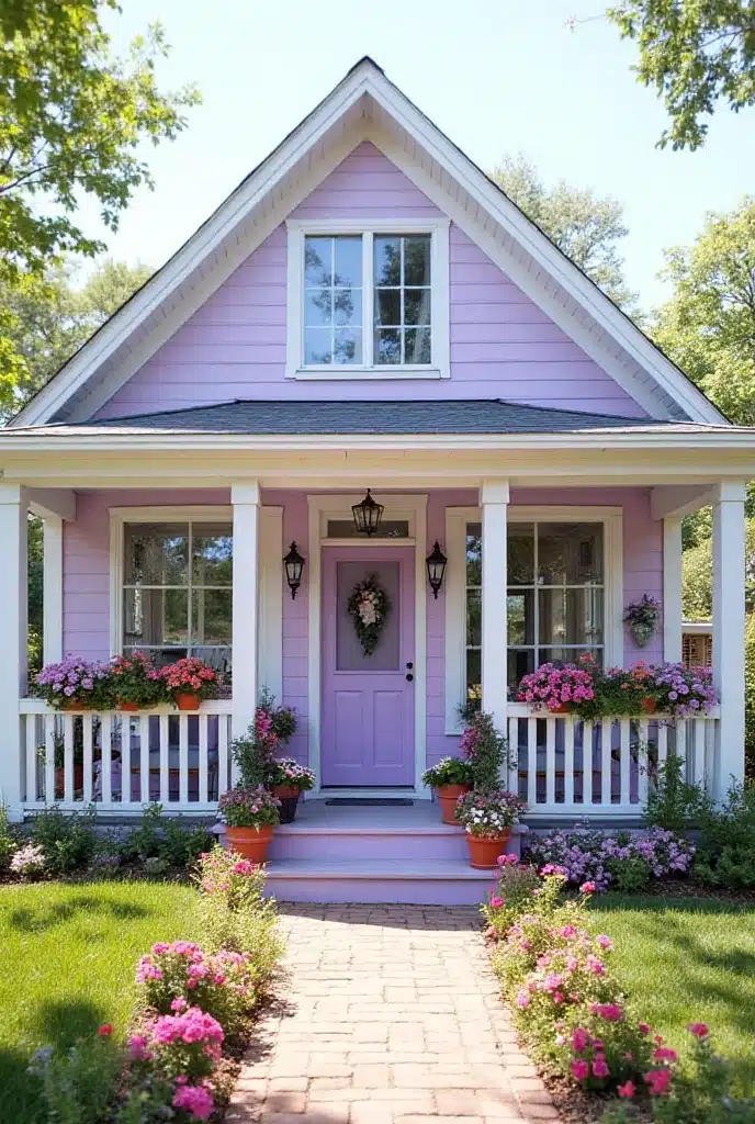
This is risky. But if done right? Stunning.
A whisper of lavender. Almost gray. Almost blush. But just enough purple to make your house feel like a dream.
Looks best on older homes with charm. Add white trim. Gold hardware. People will ask, “what color is that?” and you’ll just smile.
15. Deep Teal That Feels Like a Cool Glass of Lake Water
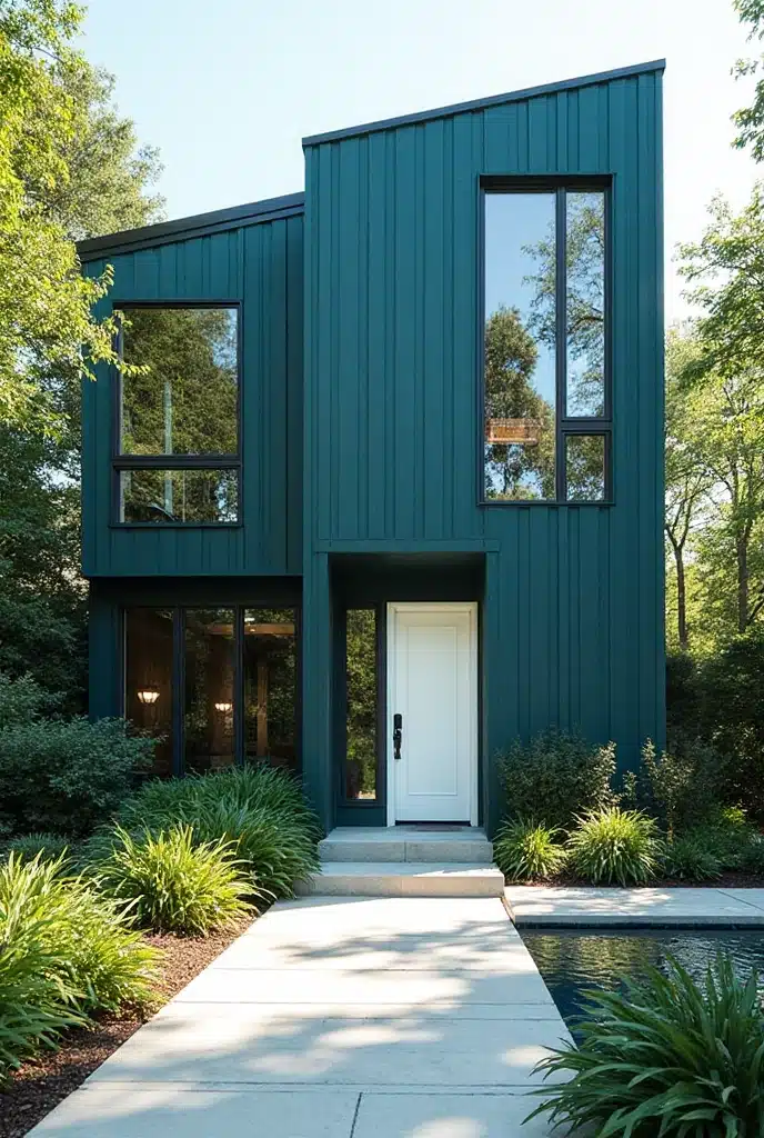
Teal gets no love. Which is sad.
Because deep teal is gorgeous. It’s rich. It’s bold. It’s unexpected.
And it’s shockingly flattering with white trim or natural stone.
Paint it on a small house and boom—suddenly it’s a jewel box. A mood. A moment.
16. Warm Greige That Actually Has a Soul

Greige is usually a safe choice. But 2025 greige? It’s got a pulse.
It’s warmer. Feels a little creamy. Like it wants to be beige but still hangs out with grays on the weekend.
It’s good for people who want neutral but not boring.
Add greenery. Add wood. Watch it come alive.
Sometimes it’s the quiet ones that steal the show.
Color is powerful. It changes how your house feels. How you feel.
It can make something bland feel bold. It can make something loud feel grounded.
The best part? It’s just paint. You can always change it. Try something. Hate it. Try again.
But if you get it right?
Every time you pull into the driveway, you’ll smile.
Every walk to the mailbox will feel like a runway moment.
Your neighbors will ask, “what’s that color called?”
And you’ll tell them. Or maybe you won’t.
Keep it a secret. Let them wonder.
Either way—your house will wear it like it was born in it.
Conclusion
Choosing the perfect exterior color for your home doesn’t have to be daunting. With these 16 exterior house color ideas for 2025, you have a wealth of stunning options at your fingertips. Remember, the right color can enhance your home’s architecture, create a welcoming atmosphere, and even increase its value. Whether you opt for a daring statement or a subtle elegance, the key is to select a palette that resonates with your personal style and complements your surroundings. So, get ready to unleash your creativity, and take the first step towards an eye-catching exterior that will leave a lasting impression. Happy painting!

Mariana is an experienced blogger and interior design enthusiast at Mood Layered. With a keen eye for aesthetics and a love for cozy, functional spaces, she shares creative home decor ideas that inspire and delight.