Let’s be real—first impressions? They matter. And your house? That’s the handshake before the hello.
Paint it wrong, and suddenly you’re that house on the block. You know the one.
But in 2025, we’re not here to play it safe. We’re here to make a statement. To strut curb appeal like it walked straight outta a design magazine.
Color isn’t just paint. It’s personality. Soul. The whisper that says, “Yes, someone lives here—and yes, we’ve got taste.”
Let’s dive into 14 bold, surprising, and totally stunning exterior color ideas that’ll make your neighbors double take (in a good way).
1. Dusty Olive Green + Warm Cream Trim
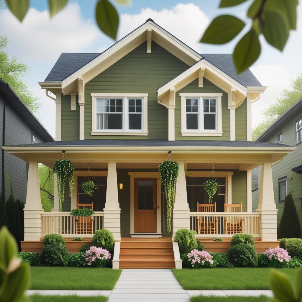
Olive’s not just for martinis or salads anymore. This dusty, grounded green has crept up from interiors and spilled gloriously onto exteriors. Pair it with a warm cream—like slightly-melted vanilla ice cream—and you’ve got a combo that feels both calm and expensive.
This one’s for the folks who want nature, but not in a tree-hugger kinda way. More like, I-grew-up-hiking-but-now-I-collect-vintage-furniture vibes.Discover the elegance of dusty olive green paired with warm cream trim. This soothing combination creates a harmonious look, perfect for homes nestled in nature.
The subtle earthiness of olive green complements the warmth of cream, enhancing the overall aesthetic while providing a welcoming feel.
2. Inky Blue-Black + Copper Accents
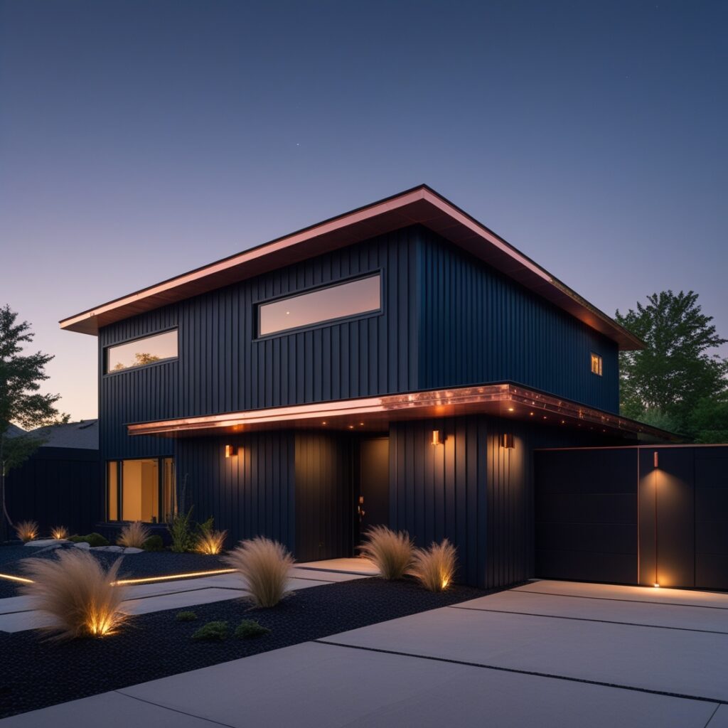
Blue so dark it’s practically black. Like storm clouds. Like velvet at night. This one’s moody in the best possible way. Add copper gutters, maybe a mailbox that gleams like a new penny—and bam. Modern drama with old soul energy.
It’s the color combo that looks like it belongs to someone who drinks espresso and knows what wine pairs with duck. Explore the dramatic allure of inky blue-black paired with rich copper accents. This bold choice adds sophistication and depth to any home. The dark exterior serves as a striking backdrop, while copper fixtures bring a touch of warmth and elegance, making the home stand out in any setting.
3. Warm Taupe + Deep Plum Front Door
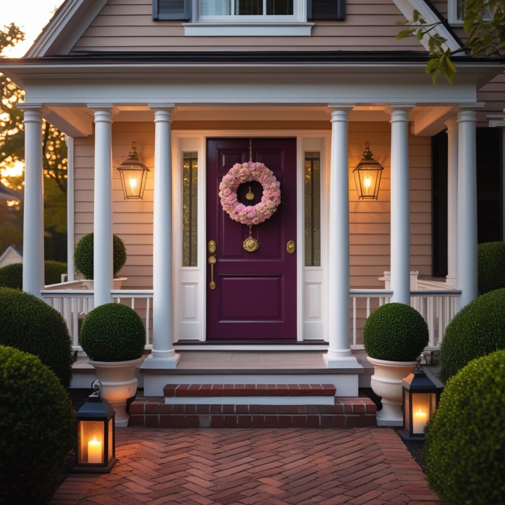
Taupe, but make it sexy. Not the bland “builder-grade beige” you’re imagining.This one’s got depth. Warmth. A hint of pink, even. And then you slap on a plum door—deep, rich, almost mysterious—and suddenly it’s like your house took a poetry class.
Trust me, this one’s a quiet flex. Especially with matte black hardware. Oof.Warm taupe serves as a versatile base color, beautifully complemented by a deep plum front door. This combination exudes coziness and charm, perfect for traditional and modern homes alike. The plum door becomes a focal point, inviting guests in with its rich hue and adding a touch of personality.
4. Terracotta Blush + Crisp White Trim
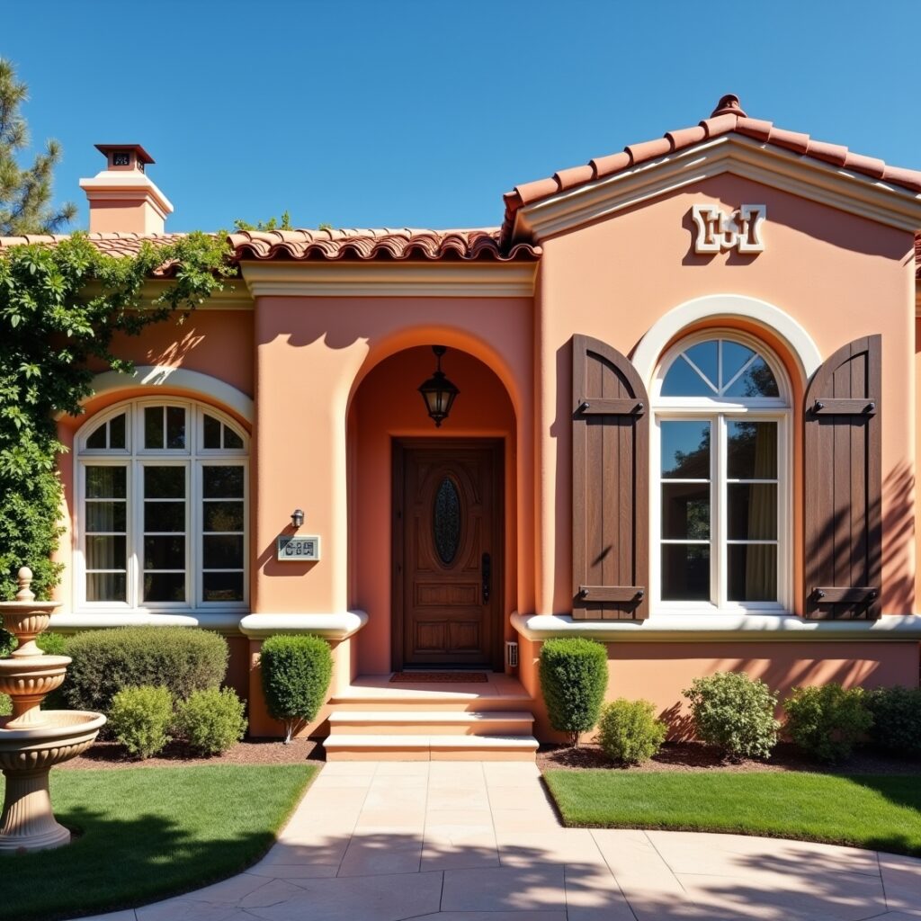
Okay, so here’s the tea. Terracotta is usually earthy and burnt. But 2025’s version? Softer. Like a desert rose. Pair it with bright white trim and you’ve got something breezy, sun-kissed, a lil bit Mediterranean. A lil bit Santa Fe. A lotta wow.
Feels like you should be sipping something fizzy on your porch. Preferably barefoot.The soft, inviting tones of terracotta blush, accented by crisp white trim, create a cheerful and welcoming atmosphere. This color scheme is ideal for coastal and Mediterranean-style homes, enhancing their architectural features while promoting a sense of warmth and friendliness.
5. Charcoal Grey + Sage Green Accents
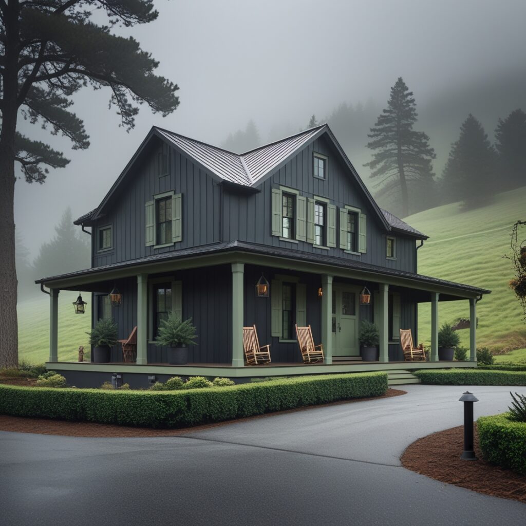
Not all greys are equal. Some feel like office carpeting. Others—like this soft charcoal—feel moody, solid, a bit mysterious. Add in sage accents: shutters, planters, maybe even the garage door. And you’ve got that earthy-modern thing that says “I compost, but also stream HBO Max.”
Perfect for craftsman-style homes that need a modern remix. Charcoal grey serves as a chic and modern base, beautifully complemented by subtle sage green accents. This sophisticated palette works well in urban settings, offering a contemporary feel while remaining grounded in nature. The sage green adds a refreshing touch, creating a balanced and stylish exterior.
6. Creamy Peach + Dusty Blue Trim
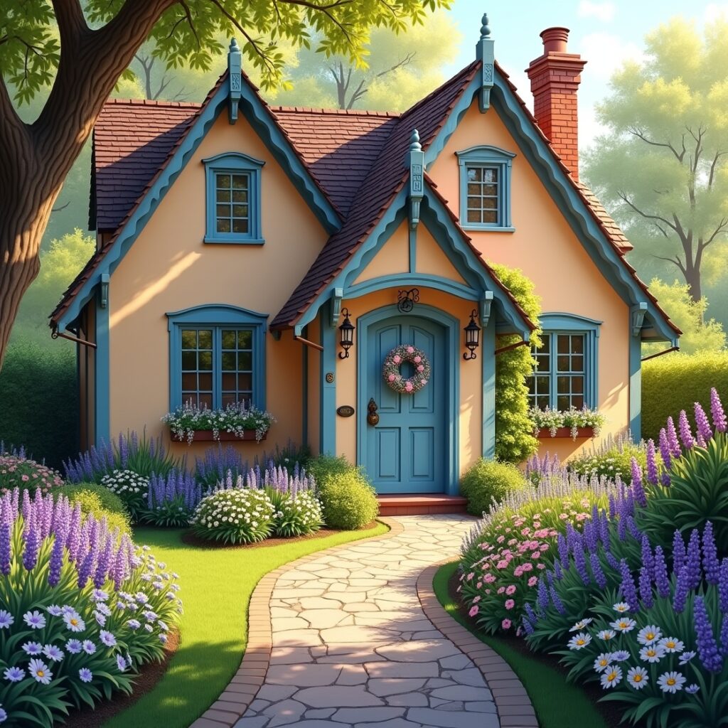
This one shouldn’t work. But it does. Oh man, it really does.
Imagine a beach house. Or a Victorian. Or literally anything with character and curves. The peach is subtle, like candlelight on skin. The blue is cool, faded denim levels of chill.
It’s playful, but not kiddish. Soft, but not shy. And it looks even better when it rains.
7. Forest Green + Black Trim
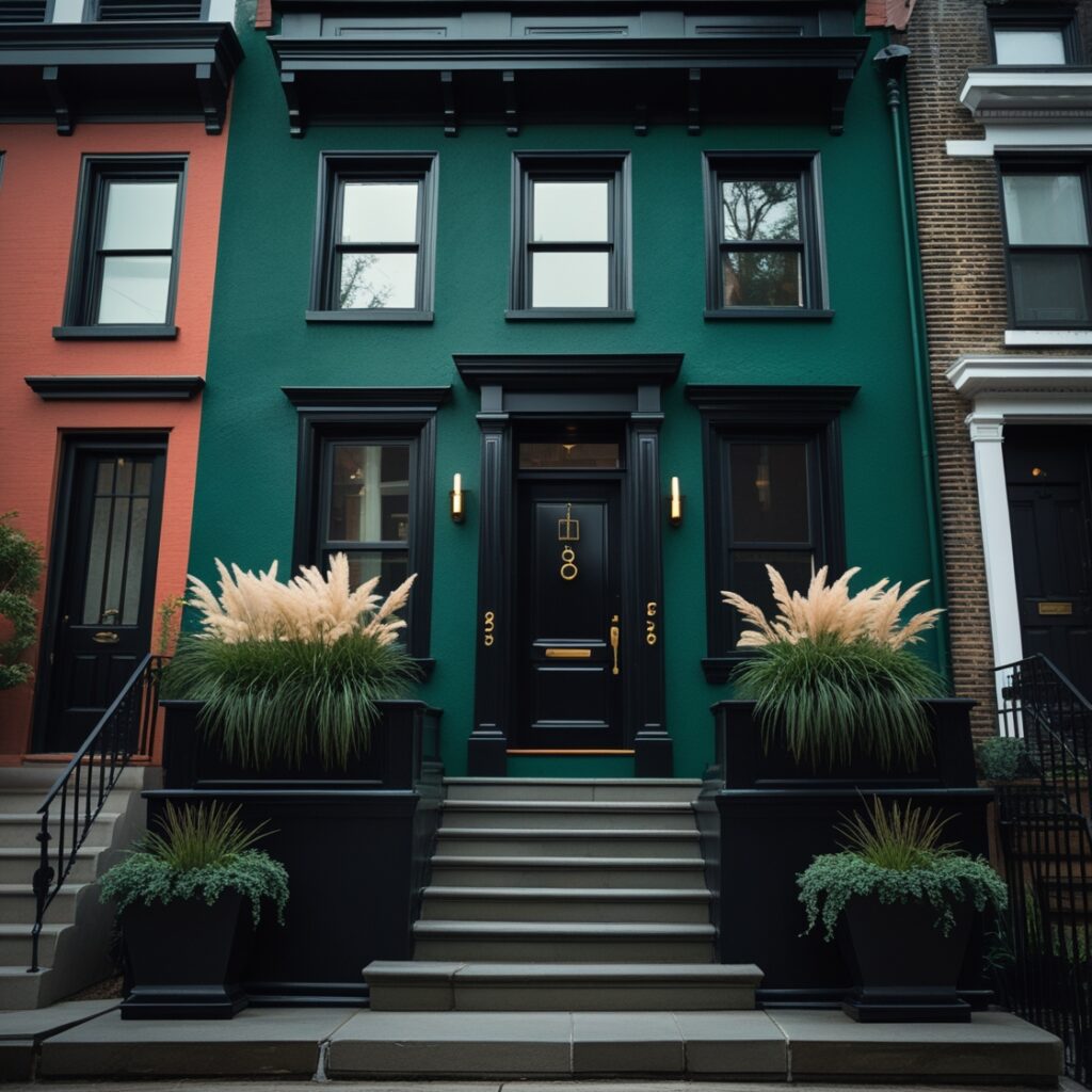
Dark green had its lil comeback in 2023, but 2025’s version? It’s bigger, bolder, and a touch more badass.
Think deep forest. Moss after a storm. That perfect dark green flannel you won’t throw away.
Now picture it wrapped around a house. With black windows. Maybe gold house numbers. This is quiet luxury—without the pretense.
8. Classic White + Natural Wood Accents
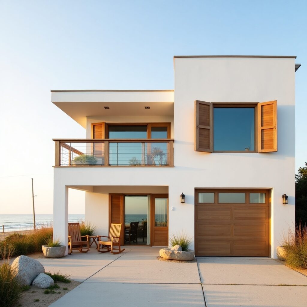
Yeah yeah, white’s not “new,” but hear me out. Done right, it still slaps.
The secret is in the contrast. Smooth, soft white with natural wood beams, slatted fences, or cedar garage doors. Maybe even a chunky wooden planter or two.
It’s giving modern farmhouse, minus the cliché. It’s timeless, like good jeans. But better. Because houses don’t sag at the knees.
9. Soft Lilac Grey + Glossy Black Trim
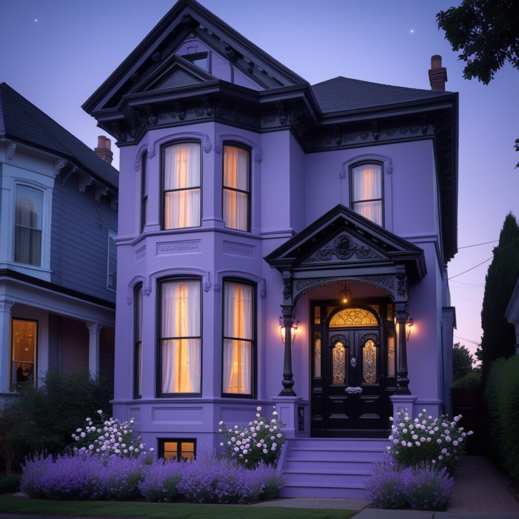
Lilac? For a house? Yeah. You heard me.
Not the candy pastel kind. This is grown-up lilac. Subtle. Cool-toned. The sort of shade you don’t notice at first, but then you’re like, “Wait… is that purple??”
Glossy black trim makes it pop. Like eyeliner on a moody watercolor painting. You’ll love it. Your HOA might hate it. But who cares?
10. Brick Red + Soft Blush Accents
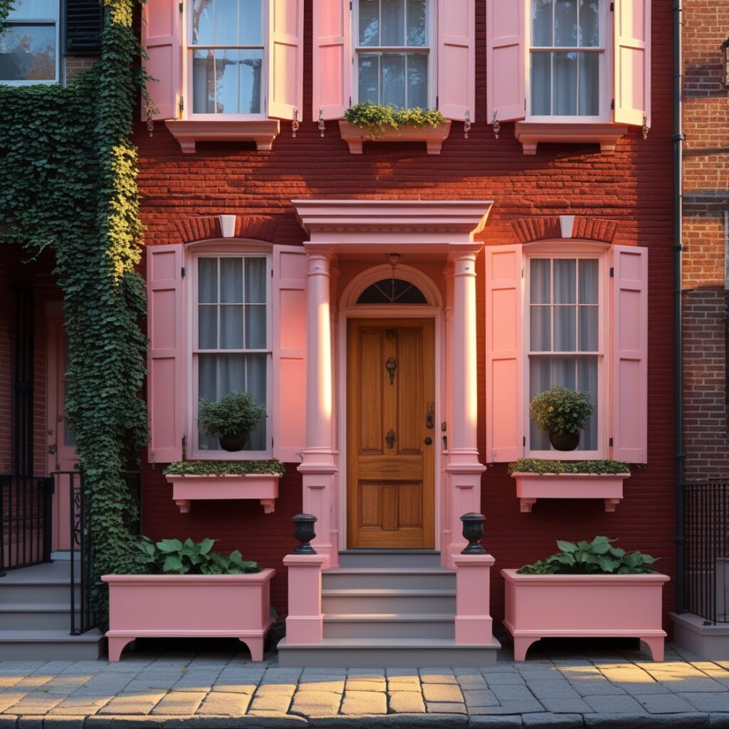
If your home’s already brick—don’t fight it. Embrace it. Enhance it.
Paint the trim and accents a super-soft blush or antique white with pink undertones. Something just barely there. That softens the red and modernizes the whole dang façade.
It’s like putting highlighter on a cheekbone. Same brick, new glow.
11. Icy Grey-Blue + Bronze Fixtures
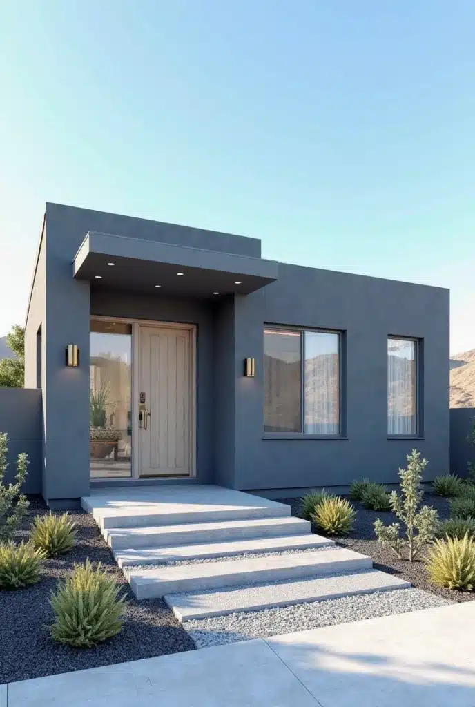
Grey-blue with a cold snap. That’s the base. Think glacier, not denim.
Now—don’t warm it up. Make it cooler, sharper. Add bronze fixtures: a metallic kick that slices right through the softness.
This is for the minimalists. The ones who say more with less. Who alphabetize their spices and somehow make it look chic.
12. Sandstone Beige + Muted Olive Trim
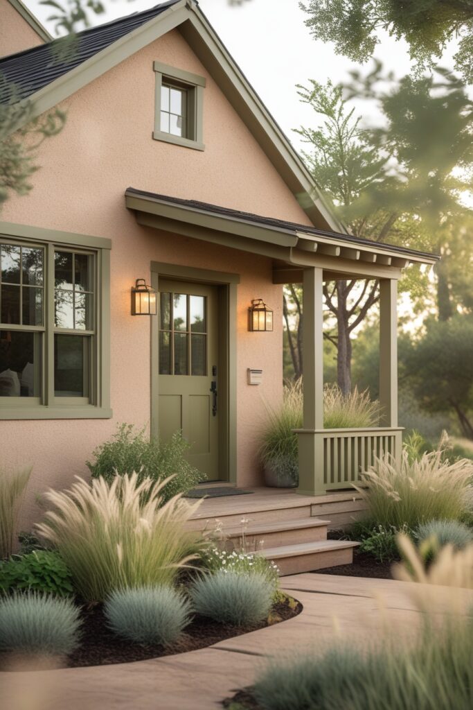
Beige isn’t boring anymore. It’s back. But with nuance.
This sandy version feels sun-washed and coastal. But not like you’re trying to sell me a timeshare.
Pair it with muted olive or eucalyptus green trim and shutters. Suddenly it’s grounded. Architectural. A little bit vintage, a little bit designer.
13. Deep Teal + Off-White Accents
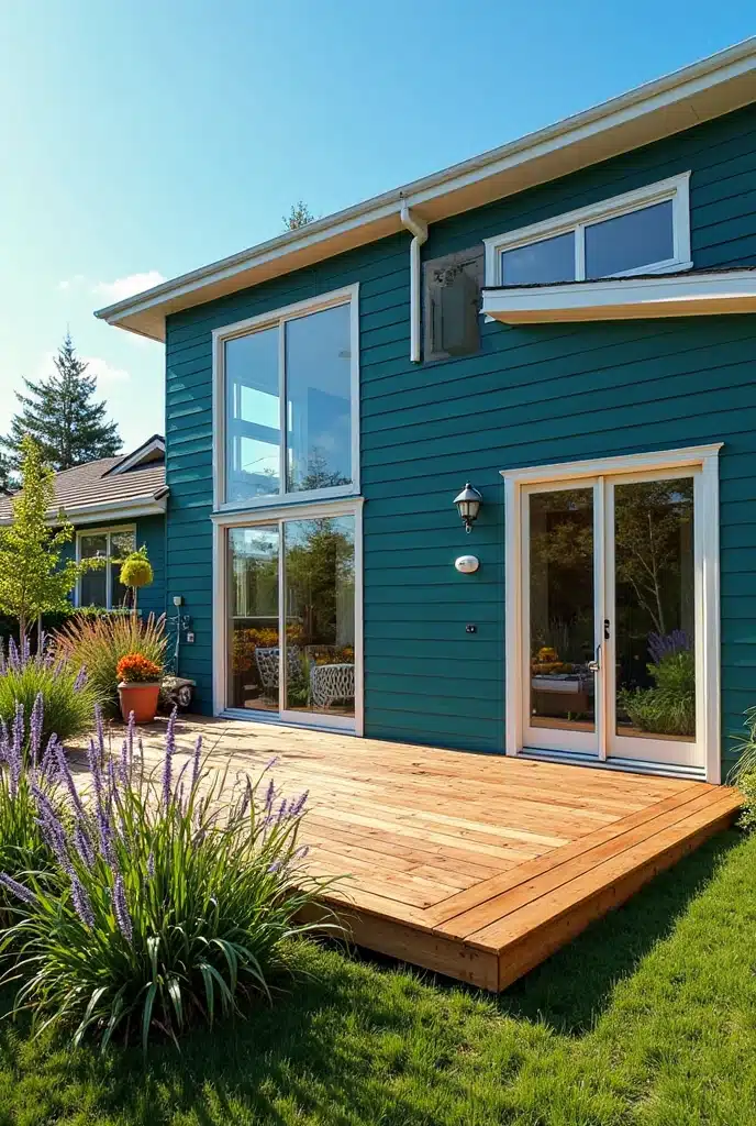
Teal is the color of 2025. Not the neon pool-party kind. The kind that feels like you dipped navy in mystery.
It looks killer on bungalows. Mid-century ranches. Even modern builds.
Add off-white trim—not stark white. Something creamy. Maybe even chalky. It makes the teal sing without stealing the spotlight.
14. Storm Cloud Grey + Golden Yellow Door
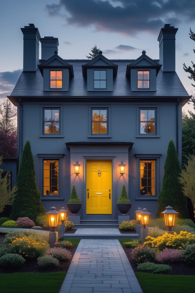
A classic. But we’ve updated the vibe.
The grey is soft, not corporate. Think early morning skies. Or an old hoodie you’ve worn since college.
And then bam—a yellow door. Not lemon. Not neon. Something golden, like sun hitting the fields. The kinda yellow that makes strangers smile as they walk past.
It’s cheerful without being cheesy. And honestly, in a world like this? We could use more of that.
—
Quick Tips For Picking Your 2025 Exterior Palette (That Don’t Sound Like a Paint Brochure)
- Look at your landscaping. Got a lotta green? A terracotta home will pop. In the desert? Go cool and pale.
- Consider the light. Morning light? Afternoon sun? That stuff changes paint colors more than you’d think.
- Check your roof color. Seriously. Don’t forget it. Your shingles are basically your house’s hat. Don’t clash the hat.
- Don’t copy the neighbor. Be inspired, sure. But don’t end up twinsies. That’s awkward for everyone.
- Sample, sample, sample. Paint big swatches. Stare at them during weird times of day. Regret is more expensive than a few sample cans.
Conclusion
In 2025, the exterior color palette for homes is more vibrant and diverse than ever, offering an array of stunning combinations that can enhance any architectural style. From the warm embrace of brick red and soft blush accents to the modern elegance of icy grey-blue and bronze fixtures, each color scheme presents unique opportunities to express personal style and creativity.
As you consider your own home’s exterior, remember that the right colors can not only increase curb appeal but also create a welcoming atmosphere that reflects your personality. Whether you prefer the comforting tones of sandstone beige and muted olive trim or the bold statements made by deep teal and off-white accents, there’s a perfect combination waiting for you.
Ultimately, your home’s exterior is a canvas that can tell your story, inviting neighbors and visitors to appreciate your vision. So, take inspiration from these 14 exterior color ideas and embark on a journey to transform your home into a stunning reflection of your taste and lifestyle.

Mariana is an experienced blogger and interior design enthusiast at Mood Layered. With a keen eye for aesthetics and a love for cozy, functional spaces, she shares creative home decor ideas that inspire and delight.